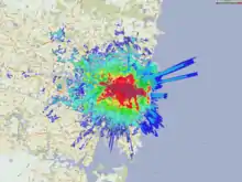
Coverage map
Coverage maps are designed to indicate the service areas of radiocommunication transmitting stations. Typically these may be produced for radio or television stations, for mobile telephone networks and for satellite networks. Such maps are alternatively known as propagation maps. For satellite networks, a coverage map is often known as a footprint.
Definition of coverage
Typically a coverage map will indicate the area within which the user can expect to obtain good reception of the service in question using standard equipment under normal operating conditions. Additionally, the map may also separately denote supplementary service areas where good reception may be obtained but other stations may be stronger, or where the reception may be variable but the service may still be usable.

Technical details
The field strength that the marked service boundary on a coverage map represents will be defined by whoever produces the map, but typical examples are as follows:
VHF(FM) / Band II
For VHF(FM) / Band II, the BBC defines the service area boundary for stereo services as corresponding to an average field strength of 54 dB (relative to 1 µV/m) at a height of 10 m above ground level. For mono it is 48 dB (relative to 1 µV/m).
The receiving antenna height of 10m dates from the 1950s when receivers were relatively insensitive and used rooftop antennas. Although this may seem unrealistic for typical situations today, when combined with the above threshold it is considered a good proxy for providing coverage to more sensitive modern receivers used without external rooftop antennas.
MF / Mediumwave
For MF / Mediumwave, the BBC defines the daytime service area boundary as a minimum field strength of 2 mV/m. At night, the service area of mediumwave services can be drastically reduced by co-channel interference from distant stations.
Limitations
Often coverage maps show general coverage for large regions and therefore any boundary indicated should not be interpreted as a rigid limit. The biggest cause of uncertainty for a coverage map is the quality (mainly sensitivity) of receiving apparatus used. A coverage map may be produced to indicate the area in which a certain signal strength is delivered. Even if it is 100% accurate (which it never is), a major factor on whether a signal is receivable depends very much on whether the receiving apparatus is sensitive enough to use a signal of that level. Commercial receivers can vary widely in their sensitivity, thus perception of coverage can vary widely.
The quality of reception can be very different at places only short distances apart, and this phenomenon is more apparent as the transmission frequency increases. Inevitably small pockets of poor reception may exist within the main service area that cannot be shown on the map due to scale issues. Conversely, the use of sensitive equipment, high gain antennas, or simply being located on high ground can yield good signal strengths well outside the indicated area. The significance of local geographical conditions cannot be over emphasised and this was underlined by an experiment which revealed the signal reception conditions around a typical house. The site did not have the critical "line-of-sight propagation" to the transmitter. Average signal levels, taken at the same height, varied by up to 6 dB, and for individual frequencies by up to 14 dB. In RF reception terms these figures are huge differences.
Although carriers and broadcasters attempt to design their networks to eliminate dead zones, no network is perfect, so coverage breaks within the general coverage areas are still possible.
There are limitations inherent to the way in which data collection for coverage maps is carried out. Traditional coverage maps are based on models, constructed from readings taken by dedicated network testers. This often means that coverage maps show the theoretical capacity of the network rather than its real-world performance. In recent years companies such as OpenSignal and Sensorly have emerged that provide coverage maps based on information crowdsourced from consumer applications. The advantage of this approach is that the coverage maps show network reach and performance as it is experienced by its users.
Often companies will construct low power satellite stations to fill in bad reception areas that become apparent once the high power transmitter's coverage map has identified where the network is deficient.