Snow White design language
The Snow White design language is an industrial design language which was developed by Hartmut Esslinger's Frog Design. Used by Apple Computer from 1984 to 1990, the scheme has vertical and horizontal stripes for decoration, ventilation, and the illusion that the computer enclosure is smaller than it actually is,[1][2] and, among them, this element was inspired by earlier Atari product design with similar stripes — but there was not a slavish mimicking of design: Steve Jobs was an Atari employee in 1974-1975.[3][4]
The design language boosted Apple's global reputation, set design trends for the computer industry, and molded the perception of computers in the manufacturing and business world.[5]
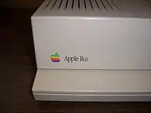
Among other design features, Esslinger's presentation of the Apple logo—a three-dimensional logo inlaid into the product case with the product name printed onto its surface—was included on nearly every product for several years.
History
In 1982, Apple officials looked outside the company and indeed the country for a designer who could help them establish the firm as a world-class company.
Snow White refers to the seven projects code-named after the Seven Dwarves on which the new design language was to be applied. Several designers were courted by Apple under the Snow White project to see what they would come up with for the seven products (of which there were actually eight). The winner ultimately was Esslinger and the resulting style assumed the project's code name.[6]
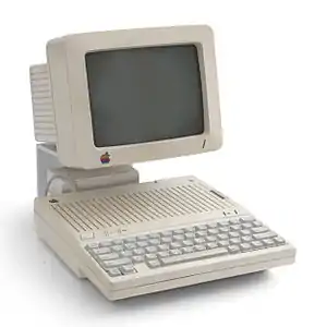
The Apple IIc computer, and its peripherals, were the first Snow White design.
Initially, Snow White debuted in a creamy off-white color known at Apple as "Fog"[7] but later other products moved to the warm gray "Platinum" color, lighter than the previous Apple "Putty" color, used throughout the Apple product line from 1987 on. Esslinger favored a bright-white color originally for the IIc, but Jerry Manock successfully argued that it would attract fingerprints. Nevertheless, Esslinger detested the original Apple beige color and insisted all Snow White-styled products use the same off-white color as the IIc. Until the change to Platinum, no Snow White designs appeared in any other color, except for the Hard Disk 20SC in order to better match the beige color of the Macintosh Plus beneath which it was designed to sit.
Beginning in 1990, the Apple Industrial Design Group gradually altered and phased out the use of the Snow White language.
Design features
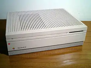
The distinguishing characteristics originated by the Snow White design language, in contrast to the original Apple industrial design style, include the following:
- minimal surface texturing
- colored a light off-white (Fog) or light gray (Platinum)
- inlaid three-dimensional Apple logo, diamond cut to the exact shape
- zero-draft enclosures, with no variances in case thickness and perpendicular walls
- recessed international port identification icons
- silk-screened product name badging
- shallow horizontal and vertical lines, 2 mm wide, 2 mm deep, spaced 10 mm apart on center, which run along any and all of the surfaces of the product, some of which act as vents and set back 30 mm from the front and 4 mm from the back
- Fog products have beige accents and cables, Platinum products have uniform color (no accents) and Smoke gray cables
- 3 mm radius, rear and 2 mm radius, front corners
- simple unadorned ports and slots
Any or all of these features indicate a Snow White Frog Design influence over an otherwise Apple-designed product. In particular the first official implementation, the Apple IIc, does not represent the complete set of design elements, while the Macintosh II includes all of them. Later, the Macintosh LC began to phase out some of the design elements.
Implementation
Apple products designed in the Snow White theme (all used the “Platinum” gray color scheme except as noted):
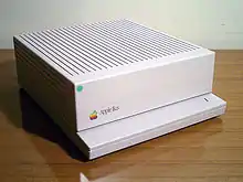

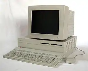
- Apple IIc (1984)[a] [b]
- Disc IIc (1984)[c]
- Apple Scribe Printer (1984)[c]
- Apple Mouse IIc (1984)[f]
- AppleTalk Connector Family(1985)[b][e]
- LaserWriter (1985)[b]
- ImageWriter II (1985)[b]
- Apple Personal Modem (1985)[b]
- Apple UniDisk 3.5 (1985)[c]
- LaserWriter Plus (1986)[b]
- Apple IIGS (1986)[a]
- Apple 3.5 Drive (1986)
- Hard Disk 20SC (1986)[d]
- Macintosh SE series (1987)[a]
- Macintosh II (1987)[a]
- ImageWriter LQ (1987)
- Apple PC 5.25 Drive (1987)
- AppleFax Modem (1987)
- Macintosh IIx (1988)
- Apple IIc Plus (1988)
- LaserWriter II (1988)
- AppleCD SC (1988)
- Apple Scanner (1988)
- Apple FDHD External Drive (1988)
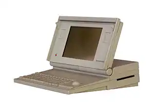
- Macintosh Portable (1989)
- Macintosh SE/30 (1989)
- Macintosh IIfx (1990)
- a:^1 2 3 While the IIc generally gets credit for being the first Apple computer released in the Snow White design language, it was not a “pure” example. Rob Gemmel (who was instrumental in soliciting Esslinger) had designed the IIc a year earlier and unbeknownst to him, Frog Design was working on their own design. In the end it was a compromise of Gemmel’s original design and Frog Design’s modifications. Likewise, the Macintosh SE was essentially Manock and Oyama’s design updated with Snow White details. The IIgs, which introduced Platinum gray, also evidenced the legacy design of the original Apple II case, in particular Manock’s wedge-shape. It wasn’t until the Macintosh II when Frog Design finally had a clean slate on which to design from the ground up, that the first pure example of pure Snow White was realized.
- d:^1 Introduced simultaneously in both Apple/Macintosh beige and “Platinum” gray to better match the beige Macintosh Plus for which it was designed to sit beneath as well as conform to the Apple IIgs color scheme released at the same time. This would be the only Snow White product to intentionally use the original beige color for the purpose of matching existing products.
- e:^1 All Apple connectors and cables began a transition to beige in 1985, however, certain Macintosh peripheral cables (e.g. mice and disk drives), despite adopting the new connector style, retained their medium-brown appearance until the transition to Platinum in 1987, at which time all cables became a dark gray color Apple called “Smoke.”
- f:^1 Though technically beige, like the connectors & cables, the Mouse IIc is considered to be colored as a Fog co-ordinated accent. It is definitely a Snow White design, which elements form the basis for the subsequent Apple Desktop Bus Mouse. It was not produced in Platinum.
Most Apple Displays introduced between 1984 and 1994 also used Snow White, except those specifically designed to match the Apple II series.
All Apple ADB keyboards and mice introduced between 1986 and 1993 were Snow White designs.
Unofficial designs
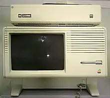
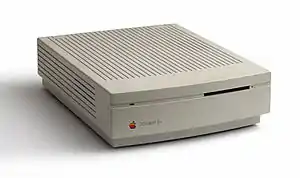
- The Lisa 2/Macintosh XL (1984) had Snow White stripes added to the front bezel redesign along with the inlaid Apple badging four months before the Apple IIc was introduced, technically making it the first Snow White product.
- The Apple Modem 300/1200 (1985) was updated from Apple beige to Fog and the inlaid Apple badging was added.
- The Macintosh Plus (1986) was updated by Frog Design, but only added the inlaid Apple badging and recessed connector icons.
- The Macintosh 800K External Drive (1986) only included the inlaid Apple badging and simple floppy disk slot styling as well as the 2 and 3 mm radius corners and zero-draft enclosure.
- The Macintosh IIcx (1989) was designed in-house entirely by Apple and, though drawing upon the Snow White corporate language, departed considerably from the guidelines. This was the beginning of Apple's efforts to break ties with Frog Design and rebuild the Industrial Design Group.
- The Macintosh IIci (1989) basically the same case as the IIcx with different internal hardware.
- Macintosh LC (1990)
- Macintosh Quadra 700 (1991)
- PowerBook 100/200 Series (1991)
- Macintosh Quadra 900 (1991)
- Macintosh Quadra 950 (1992)
- PowerBook Duo Dock (1992)
- Macintosh LC II (1992)
- Macintosh IIsi (1993)
- Macintosh LC III (1993)
- Macintosh LC III+ (1993)
- Macintosh LC 475 (1993)
- Apple Workgroup Server 95 (1993)
- Apple Workgroup Server 9150 (1994)
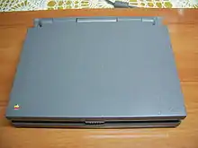
Both the 100- and 200-series PowerBooks and accessories were intended to tie into the rest of the Apple desktop products using the corporate Snow White design language. However, the light colors and decorative recessed lines did not seem appropriate for the scaled-down designs. In addition to adopting the darker grey color scheme which co-ordinated with the official corporate look, they also adopted a raised series of ridges mimicking the indented lines on the desktops. These early PowerBooks would be the last to use the aging Snow White look and the only ones to make such a radical adaptation of it.[6]
See also
References
- Esslinger, Hartmut (10 September 2013). "Keep It Simple". designmind.frogdesign.com/. Retrieved 21 January 2014.
- Bidgoli, Hossein (2010). The Handbook of Technology Management: Supply Chain Management, Marketing and Advertising, and Global Management. Hoboken, New Jersey: John Wiley & Sons. p. 314. ISBN 978-0470249482.
- "An exclusive interview with Daniel Kottke". India Today. September 13, 2011. Archived from the original on May 18, 2012. Retrieved October 27, 2011.
- Isaacson 2011, pp. 42–43.
- Kahney, Leander (2008). Inside Steve's Brain: Business Lessons from Steve Jobs, the Man Who Saved Apple. London: Atlantic Books Ltd. ISBN 978-1-848-87784-9.
- Kunkel, Paul. AppleDesign: The work of the Apple Industrial Design Group, with photographs by Rick English. New York: Graphis, 1997, p.30
- History of computer design: Apple IIc
External links
- Apple and the History of Personal Computer Design: Snow White
- Apple IIc writeup (first Snow White machine)
