CSS grid layout
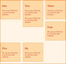
In Cascading Style Sheets, CSS grid layout or CSS grid creates complex responsive web design layouts more easily and consistently across browsers.[1] There have been other methods for controlling web page layout methods, such as tables, the box model, and CSS flex box. CSS grid is currently not an official standard (it is a W3C Candidate Recommendation) although it has been adopted by most major browsers.[2]
| Cascading Style Sheets |
|---|
| Concepts |
| Philosophies |
| Tools |
| Comparisons |
Motivation

CSS grid can create more asymmetrical layouts than the previous grid and layout options like CSS floats. It also allows for more standardized code that works across browsers. This is in contrast to relying on specific browser hacks or complicated workarounds.[2]
One issue with exploiting floats in CSS is that if the content gets added to one portion of the page it could disrupt the flow of the page and break the layout. This is due to the varying heights for layout elements.[2] Though CSS flex box supports flexible layouts and provides the flexibility of creating complex layouts, it fails when the need for creating responsive layouts in 2-dimensional space arises.
Browser support
As of October 2017, Chrome, Firefox, Safari and Edge all support CSS grid without vendor prefixes.[3][4][5] IE 10 and 11 support CSS grid but with an outdated specification. On mobile, all modern browsers support CSS grid except for Opera Mini and brave Browser. Web developers targeting older browsers can utilize Modernizr 3.5.0 to detect and gracefully degrade the webpage as needed. [6]
Utilization in frameworks
There are no current web frameworks that incorporate CSS grid, in contrast with CSS flex box which is used in frameworks such as Bootstrap 4 and Foundation 6.[7]
the fr unit
The "fr" unit is often used with CSS grid layout.[8][9][10] The "fr" unit, part of the CSS grid layout specification, represents a fraction of the leftover space in the grid container.[11]
Examples
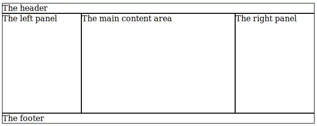
Here is an example of the holy grail layout:

<html>
<style>
div { border: 1px solid; }
body {
    display: grid;
    grid-template-columns: 10em auto 10em;
    grid-template-areas:
        "header header header"
        "left   middle right"
        "footer footer footer";
}
</style>
<body>
    <div style="grid-area: header">The header</div>
    <div style="grid-area: footer">The footer</div>
    <div style="grid-area: left">The left panel</div>
    <div style="grid-area: middle; height: 200px">The main content area</div>
    <div style="grid-area: right">The right panel</div>
</body>
</html>
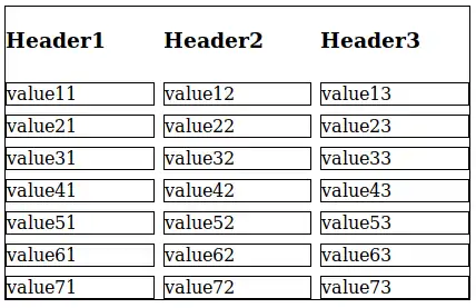
Here is an example of a table of values:

<html>
<style>
.wrapper {
    display: grid;
    grid-template-columns: 1fr 1fr 1fr;
    grid-gap: 0.5em;
}
div {
    border: 1px solid;
}
</style>
<body>
    <div class="wrapper">
        <h3>Header1</h3><h3>Header2</h3><h3>Header3</h3>
        <div>value11</div><div>value12</div><div>value13</div>
        <div>value21</div><div>value22</div><div>value23</div>
        <div>value31</div><div>value32</div><div>value33</div>
        <div>value41</div><div>value42</div><div>value43</div>
        <div>value51</div><div>value52</div><div>value53</div>
        <div>value61</div><div>value62</div><div>value63</div>
        <div>value71</div><div>value72</div><div>value73</div>
    </div>
</body>
</html>
References
- "CSS Grid – Table layout is back. Be there and be square". Google. Retrieved 6 October 2017.
- "CSS Grid Layout Module Level 1". W3C. 9 May 2017. Retrieved 7 October 2017.
- Anderson, Kareem (13 September 2017). "Microsoft's newest browser gets a significant boost with EdgeHTML 16". Retrieved 7 October 2017.
- Protalinski, Emil (9 March 2017). "Chrome 57 arrives with CSS Grid Layout and API improvements | VentureBeat". VentureBeat. Retrieved 7 October 2017.
- "CSS Grid Layout". Can I Use. Retrieved 7 October 2017.
- Ates, Faruk. "Modernizr 3.5.0".
- "Flexbox grids and frameworks".
- "CSS Grid Layout: The Fr Unit".
- "Fractional.".
- "An Introduction to the `fr` CSS unit"
- "Flexible Lengths: the 'fr' unit"